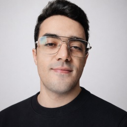
Mohamed ManaiHello

Full-stack designer with 10 years between design, tech and what’s in between.

Currently building

  • [Design Engineer] Under NDA but I am pretty sure humanity can survive another SaaS.

    Fundraising stage

  • [Solo Builder] iOS app that turns everyday walking into a game.

    Closed beta testing

  • [Co-Builder] PrivateDrive: a private driver service for tourists visiting Paris.

    +€4K MRR

  • [Design Engineer] Matchmaking platform between event organizers and event sponsors, with an ROI dashboard.

    Fundraising stage

Works

Case studies

Case study 1 of 3: Verisure

Verisure

Transforming Verisure’s Digital Experience

  • UX
  • Product Design
  • Design System
  • B2C
Read case study

//password-protected: they hold client work and data that stay off the public web.

Request access
Other projects

  • Samsung

    Helping Samsung professional users embrace AI

    • UX
    • Marketing
    • B2B
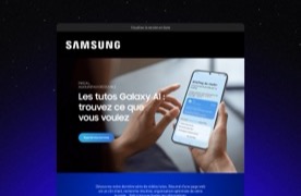
    Samsung’s Galaxy AI tutorials email, with a hand holding a phone showing the morning briefing.

    Helping Samsung professional users embrace AI

    • UX
    • Marketing
    • B2B
    Client
    Samsung
    Role
    UX Designer
    Duration
    4 weeks
    Year
    2025
    Team
    • 1 Manager
    • 1 Creative Director
    • 1 UI Designer
    • 1 Copywriter
    • 2 Devs

    The problem

    Problem
    Galaxy AI was the headline of the Galaxy S25 launch, but its adoption among professional users in France fell short of Samsung’s expectations: less than 10% had tried a feature.
    Goal
    Turn Galaxy AI from a launch promise into a daily work habit for pros, and grow adoption steadily over the following quarters.

    Outcome

    email click-through rate, +12 pts above Samsung’s average CRM campaign
    42%
    of landing page visitors opened at least one AI use case
    41%
    AI feature adoption among pro users in the following quarter
    +5%

    Key decision

    Show how AI helps with a busy workday, one theme a week

    Galaxy AI has too many features for one email. We split it into three weekly emails, each on one theme, and ended each with a teaser for the next.

    How it works

    Each week’s email leads to its own section of the landing page, where that theme’s video tutorials live.

    Final design preview

    Samsung’s first Galaxy AI tutorials email: three video tutorials, a teaser for next week’s theme, and a contact block.
    The first email of the series, as shipped. Scroll inside the frame to see all of it.

    What I did

    • Picked the AI use cases most relevant to pro users, which shaped the campaign strategy
    • Set the direction for the tone of voice and focus of the copy: benefits, not features
    • Designed the wireframes and iterated on structure to lift click-through
    • Designed the structure and content layout of the landing page, and iterated with the UI Designer through final validation
    • Worked with developers to adapt Samsung’s design system components
  • Septodont

    Building Claire: The AI-Powered Sales Chatbot for Septodont

    • UX
    • AI
    • Chatbot
  • TotalEnergies

    Clara: The Conversion-Focused Chatbot for TotalEnergies Mobility
    • UX
    • AI
    • Chatbot
  • Solvay, Syensqo

    From one brand to two

    • UX
    • Design System
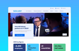
    Solvay’s homepage: the header and main navigation, above a news carousel with a photo from an event.

    From one brand to two

    • UX
    • Design System
    Client
    Solvay, Syensqo
    Role
    UX & Product Designer
    Duration
    8 months
    Year
    2023–2024
    Team
    • 1 Strategy Manager
    • 1 Design Manager
    • 1 Copywriter
    • 1 UI Designer
    • 4 Devs
    • 1 PM
    • 1 SEO

    Context

    Solvay’s corporate split created Syensqo, its innovation twin. Everything lived on one website, so its content had to be sorted, moved to two new sites, and completed wherever either one was missing pages.

    Outcome

    • One multi-brand design system: a shared base that Solvay and Syensqo each adapt to their own brand.

    Key decision

    One design system for both brands, not two.

    Both websites run on the same technical infrastructure, built on a Drupal CMS. Rather than two separate design systems, we built one that each brand adapts to its own identity.

    DS preview

    The Syensqo design system: slate headings, cream grounds and a coral accent, Poppins headings over Raleway, and flat, square components, including a photo card of a scientist at a microscope.
    The Solvay design system: navy and blue colours, Poppins headings over Roboto, and components with soft 15px corners and shadowed cards, including a photo card of an engineer in a Solvay hard hat.
    The Solvay and Syensqo design systems: one shared set of components, two brands.

    What I did

    • Led the UX design work, mainly the information architecture: sorting the old site’s content between the two new sites and planning the pages each one was missing
    • Ran a UX benchmark and a usability audit
    • Facilitated stakeholder workshops to define each website’s audience and design direction
    • Delivered a sitemap for each website
    • Designed one set of wireframes shared by both brands, with two clickable lo-fi prototypes, desktop and mobile, to align stakeholders before development started
    • Designed the full design system, components and documentation, for the developer handover
  • Accor

    Building a tool for mapping and tracking customer journeys across Accor in Figma

    • Internal Tool
    • Prototype